Table of Contents
Take your digital brush and pencil. Because this article makes the experience for your Chrome extension the best for all users. Most developers do not think about this user experience. Because this is the most important point for a good Chrome extension. And this brings a huge benefit to the users.
In this post, I will explain to you the important 5 user experiences (UX) that Google did not tell you when you were building your first Chrome extension Manifest V3. A good user experience makes the Chrome extension’s user interface accessible to all users. Such as readable text, good contrast for the text and background, etc.
Disability is part of being human. Almost everyone will temporarily or permanently experience disability at some point in their life. An estimated 1.3 billion people – about 16% of the global population – currently experience significant disability. This number is increasing due in part to population ageing and an increase in the prevalence of noncommunicable diseases.
Source: WHO (World Health Organization) publication on 2 December 2022
Accessibility is very important for everyone (people with color blindness, eye strain, eye fatigue, deaf people, etc.). As I see, many developers ignore or forget this point. So with not adding this accessibility and UX improvement in its Chrome extension, it is only ready for 84% of the world’s population. And the small things that can give huge improvements for the users of your Chrome extension. Such as implementing a dark mode theme that matches the coherence of your Operating System appearance, and makes the screen reader read the correct label for that interface action.
Accessibility of a Chrome extension Manifest V3
1. Use CSS dark mode
Dark Mode is the first Accessibility feature that developers do not immediately think of when creating a Chrome extension. The Dark Mode is to define a color scheme that uses light-colored text and other UI elements on a dark-colored background. By default, when creating a new web page, it is always a light theme. That contains a white background and the text color in black.
Implementing a Dark Mode style for the Popup page, New Tab page, and Options page is very easy to set it up in the stylesheet document. The web browser will choose the correct theme depending on your Operating System’s appearance setting. So when you switch your operating system from light to dark. The web browser will automatically show you a dark version of that web page. No JavaScript code is needed to get this comfortable experience for your users.
The code of the Options page stylesheet can be as this:
/* Light mode */
:root {
   --totl-primary-background: #fff;
   --totl-primary-font-color: #000;
}

/* Dark mode */
@media (prefers-color-scheme: dark) {
:root{
   --totl-primary-background: #232323;
   --totl-primary-font-color: #fff;
}

body{
   background-color: var(--totl-primary-background);
   color: var(--totl-primary-font-color);
}
In the head of the HTML Options page this must be added:
<meta name="color-scheme" content="light dark">
<meta name="theme-color" content="#ffffff" media="(prefers-color-scheme: light)">
<meta name="theme-color" content="#232323" media="(prefers-color-scheme: dark)">
The meta name="color-scheme" specifies the color scheme via the meta tag, so the browser can adapt to the preferred scheme faster. And the meta name="theme-color" is needed for the top navigation bar to have the same dark or light theme colors. The Chrome desktop web browser is this not supported. However, the Safari iOS mobile and Samsung Internet do support this theme.
In your Chrome extension Manifest V3, for images on your HTML web page, you can do this method to get a light and dark mode. So the visual design is in harmony with the light and dark modes.
<picture>
   <source srcset="dark.png" media="(prefers-color-scheme: dark)">
   <img src="light.png" alt="Preview element">
</picture>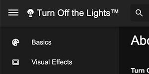
When implementing this HTML code, this will not load two images, only the image on that Operating System appearance that is active. For example, when Dark Mode is enabled in your Operating System, then it will download the dark.png and vice versa.
2. Use ARIA annotation
The ARIA abbreviation stands for Accessible Rich Internet Applications. This is to set the roles and attributes to make it accessible for people with disabilities. So it can use the Operating System’s voiceover to help and guide the user on that web page. For example to know which interactive element can be clicked.
What elements can be used with aria-label?
- Interactive elements:
Such asawhen there ishrefan attribute is present,audioandvideowhen there iscontrolsan attribute is present,input,select,button,textarea - Implicit landmark elements:
Such asheader,footer,nav,main,aside,section, andform - Explicit landmark elements:
Such as an element withrole="navigation" - Widget role elements:
Such as an element withrole="dialog"orrole="tooltip"(there are 27 widget roles in ARIA 1.1) iframeandimgelements
When to use it?
The aria-label is the string value that is used when there is no other visible text in this DOM node. Then you can best use this aria-label and describe the action of this interactive element. However, when there is visible text in that label or element, use aria-labelledby instead. And link it with that id of that node.
The aria-label code example:
<button aria-label="Main menu" class="icon"></button>The aria-labelledby code example:
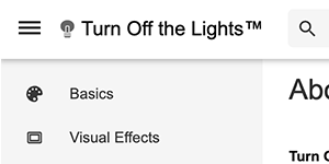
<nav aria-labelledby="nav-title">
  <h2 id="nav-title">Sidebar Content</h2>
  <ul>
     <li>Basics</li>
     <li>Design</li>
     <li>About</li>
  </ul>
</nav>
The aria-label is only “visible” to assistive technologies such as a screen reader that can tell the element function. And it will not be visible on the website content to the user.
3. WebP images and @2x Retina images
WebP
To lighten up the Chrome extension Manifest V3 package, use webp images on your Options page and popup panel. The smaller the image resources, the faster the web page opens. And to provide the users with a smooth and snappy experience. So with an instant click, you can see the content.
WebP lossless images are 26% smaller in size compared to PNGs. WebP lossy images are 25-34% smaller than comparable JPEG images at equivalent SSIM quality index.
Google Developer WebP documentation
The WebP is a modern image format that provides the users huge benefits, that provide the images in a superior lossless and lossy compression on the web. This replacement JPEG, PNG, BMP, and GIF file formats.
Note: The Chrome extension Manifest V3 icon for the browser action button and context menu needs to be a png file type. The web browser does not support webp and SVG file types.
Retina
The name Retina, is the brand name of the technology company Apple, as it is known as the first that brings high-DPI, or high dots per inch displays mass-produced for consumers. That was for the iPhone 4 device released in June 2010.
Today most new devices have an HDPI display (or on Mac computers known as a retina display). So if you are adding an image, try adding @2x images. So everything looks pixel-sharp. Because any blurriness or low-quality image makes the Chrome extension incomplete for the user. And may think the Chrome Extension Manifest V3 is not ready or they are just testing a beta version of it.
You can use 2 ways to set a high-quality image on your HTML web page. That with the simple way or the advanced way.
Simple
The simple way is to get only 1 regular (for non-HDPI screens) and 1 HDPI image in the image node:
<img
 id="loadinglamp"
 alt="Turn Off the Lights lamp button"
 width="16"
 height="16"
 src="images/icon16.png"
 srcset="images/icon16.png 1x, images/icon16@2x.png 2x">
Advanced
The advanced way is to get support for multiple screen sizes. Multiple screen sizes that depend on the platform (desktop, tablet, or mobile) the user is using your Chrome Extension Manifest V3:
<img
src="small.png"
srcset="large.png 2000w, medium.png 1000w, small.png 320w"
sizes="(min-width: 60em) 33.3333vw, (min-width: 38em) 50vw, 100vw"
alt="Example image">
Build for all screens in the above srcset the attribute we are telling the web browser that there are 3 different images to choose from:
large.pngwhich has a pixel width of2000medium.which has a pixel width ofpng1000small.which has a pixel width ofpng320
The smaller screen size can be handy in the future when Chrome extension Manifest V3 will be allowed on iOS and the Android Chrome web browser. So the same Chrome Extension Manifest V3 code can be used on all mobile web browsers.
So think about the future and build it now for the future. To get a harmoney web experience for desktop, and mobile.
Stefan Van Damme Developer Quote
4. Use lazy load (iframe and images)
The other important point is speed as part of Accessibility. Slow web pages create a bad experience. Do you use many embedded videos or images that are not visible in the view part of the web page? Then you can best use the lazy attribute. Lazy loading is a strategy to identify resources as non-blocking (non-critical) and load these only when needed. It is a way to shorten the length of the critical rendering path, which translates into reduced page load times.
<img src="image.webp" alt="Stefan vd Logo" loading="lazy" />
<iframe src="video-player.webm" title="Stefan vd Video" loading="lazy"></iframe>
5. Fit your mobile screen layout
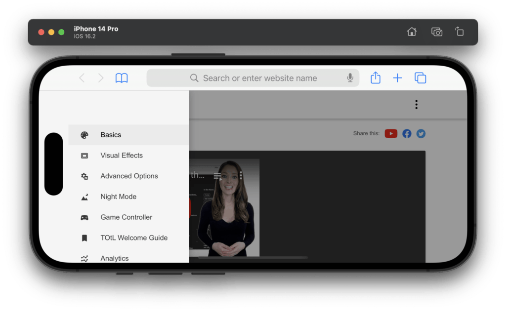
Design your Chrome extension for mobile. And that is about the Options page and popup panel.
Because in Safari 15 you can port your Chrome Extension Manifest V3 to Safari and get your Chrome extensions running on iOS and iPadOS.
However, it needs some design improvement such as the notch and the touch experience. The certain button must be bigger than 48px in width and height, so your finger can tap on it. And the notch on the top in the latest iPhone model, you must place a viewport to make sure your content stays under this panel and not in it. Even with the dynamic island, it is smaller than the previous one. However, it overlaps your web content and a correct alignment is needed to get the content visible.
With this code in your HTML web page, it will be in the safe area of your mobile device. That works for the finger reader below your screen and the Face ID notch.
<meta name="viewport" content="width=device-width, initial-scale=1, viewport-fit=cover">After that, your HTML page will fit the full screen and height of your iPhone X design. So the content is under the notch of the iPhone X design. However, in portrait orientation, the view may be good for the users, but in the landscape, you will find that the notch will overlay your website content. And to solve this problem, your visible element will be visible in this landscape mode by adding the CSS safe area code. That for each of the corners of the screen:
safe-area-inset-leftsafe-area-inset-rightsafe-area-inset-topsafe-area-inset-bottom
Here is a CSS example of how to get the navigation bar from a safe distance from the notch. That is used in the Turn Off the Lights Safari extension for the Options page to customize the experience for the users.
nav{
   position:absolute;
   width: 200px;
   left: env(safe-area-inset-left);
}
And maybe soon on Chrome Extension Manifest V3 support on Android. It is logical to get this experience on all devices. As the primary launch Turn Off the Lights Samsung Internet extension went previous week online for Android users using the Samsung Internet web browser.
Addition resource
To learn more about Chrome Extension Manifest V3 APIs and continue to create a creative experience for the users, see these resources:
- Mozilla Accessibility ARIA documentation
- Webp images documentation
- Chrome Developer Documentation
- MDN Browser Extensions
- Safe Areas iPhone X Documentation
Final remarks
In my previous post, I provided an easily understandable beginner tutorial on how to create your first Chrome extension Manifest V3. With an explanation of which developer environment you can use to get started. And the brief architecture overview of what component can be included in a Chrome extension Manifest V3.
A fundamental of Chrome (also the Chrome motto in every conference and summit) is the 4 S. And that said here also for the Google Chrome web browser is Speed, Security, Stability, and Simplicity. For Chrome extension Manifest V3 is a start to bringing this performance, security, and privacy for the users.
In this article, you have learned the accessibility features you need to add to your Google Chrome extension Manifest V3. If you are a beginner/junior, or medior developer, you can follow these handy tips for your Chrome extension. Even if you are a senior developer creating unique and popular Chrome extensions such as me. You can fine-tune your Chrome extension Manifest V3 so it will be accessible for all users, that include the 16% of the global population that has a disability. Your users will appreciate this change when they users are browsing the web daily on their personal or work computers.
I did these tips already in my unique Chrome extension Turn Off the Lights. I hope you enjoyed my new Chrome extension Manifest V3 accessibility user experience tip post. That I want to share this with the browser extension community. So you get to build this high-quality experience for the users. If you would like to support me, consider a small donation to my web community work.